Most websites aren’t intentionally inaccessible — but that doesn’t stop them from excluding people every day
This guide is a practical starting point for nonprofit communicators who want to think about accessibility earlier, ask better questions, and build websites that actually work for everyone. Whether you caught our talk at Create Good or you’re coming to this fresh, everything here is designed to be actionable without being technical.
Most accessibility problems are planning problems
That means they are our responsibility to fix.
Key Takeaways
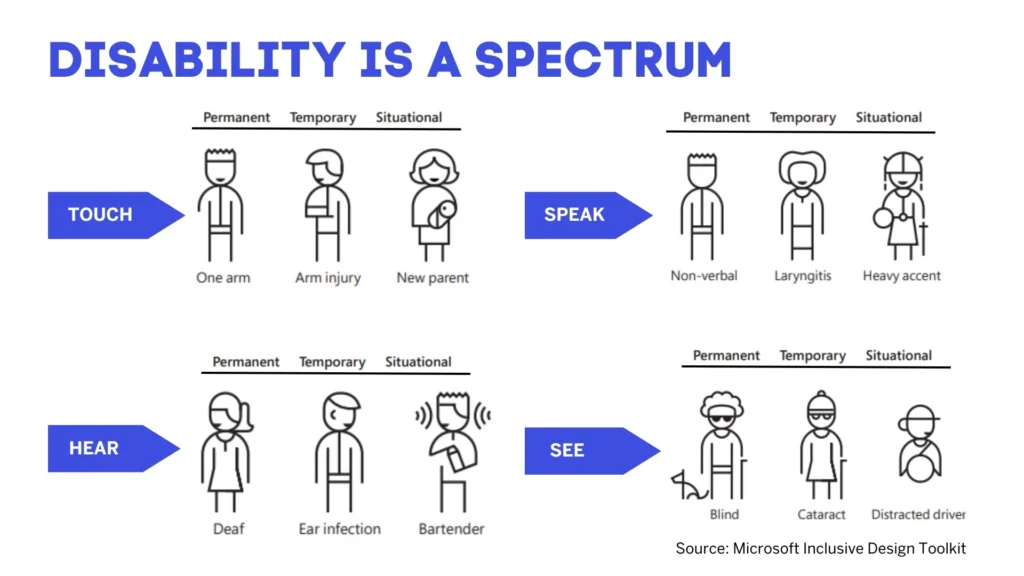
Design for One, Extend to Many
This is a thoughtful and elegant approach to UX accessibility. When you open your thinking up to consider other abilities as the default, you end up including no only people with disabilities, but also temporary and situational issues that can cause navigation, visual, or audio issues with a website.
Content Accessibility Quick-Reference
Every time you publish a blog post, upload a PDF, or add an image, you’re making an accessibility decision. Here’s a quick reference for the decisions that matter most:
Recommended WordPress Plugins
WP Accessibility (Free)
The most widely-used accessibility enhancement plugin for WordPress. It adds skip-to-content links, visible focus indicators, and fixes common theme accessibility issues like missing form labels and improper ARIA attributes. It’s a great starting point for any WordPress site and works alongside any theme.
Accessibility Checker by Equalize Digital (Free + Pro)
This plugin audits your content directly inside the WordPress block editor. As you write, it flags issues like missing alt text, skipped heading levels, and vague link text. The free tier covers individual posts; Pro adds site-wide scanning and reporting.
This would be an excellent ongoing accessibility tool.
Free Testing Tools
You don’t need expensive software to find accessibility issues. These free tools will catch the most common problems:
(note you will need to use Google Chrome for these tools.)
WAVE Browser Extension
A visual accessibility evaluation tool from WebAIM. Install it as a browser extension, click it on any page, and it overlays icons showing errors, alerts, and structural elements. The most popular free accessibility testing tool for a reason.
axe DevTools by Deque
A browser extension that runs automated accessibility tests and provides detailed, developer-friendly results. More technical than WAVE, but excellent for thorough audits. The free version covers core testing; paid tiers add guided manual testing.
Google Lighthouse
Built right into Chrome DevTools (no installation needed).
Go to View > Developer > Developer Tools, click on the right arrow on the right side of the menu bar and select the Lighthouse tab. Ensure the accessibility check box is selected and run an audit. It’s not as thorough as WAVE or axe, but it’s the fastest zero-effort option.
WebAIM Contrast Checker
A simple, focused tool for checking whether your text color has enough contrast against its background. Paste in two hex color values and it tells you whether you pass WCAG AA and AAA standards. Bookmark this one — you’ll use it more than you think.
Further Reading
Want to go deeper? These are some of the best resources available:
- WebAIM (webaim.org) — The gold standard for web accessibility education. Their articles, training, and tools are used by organizations worldwide.
- The A11Y Project (a11yproject.com) — A community-driven resource with a checklist, blog posts, and plain-language explanations of WCAG guidelines.
- WCAG 2.2 Quick Reference (w3.org/WAI/WCAG22/quickref) — The official W3C quick reference guide. More technical, but the authoritative source.
Need Help Making Your Website Accessible?
Accessibility is about the intention to making your website usable for everyone. But knowing where to start can be the hardest part. If your nonprofit is planning a website redesign, needs an accessibility audit, or wants help building inclusive digital experiences from the ground up, we’d love to talk.
Let’s make your website work for everyone
BC/DC Ideas is a nonprofit communications agency specializing in strategy, design, and digital experiences that amplify good.